Building a model for shot effectivity of the great Kobe Bryant.
Intro
I was looking for a nice dataset to practice my feature engineering and modelling skills in python when I came across the complete set of Kobe Bryant shots in the NBA in Kaggle. Being a long time NBA (and Kobe in particular) fan, I could not resist.
The task here is to explore this beautiful dataset, identify what features affect the probability of making the shot and build a classification model to predict the shot outcome.
I will use these libraries:
- pandas for feature engineering
- seaborn for visualization
- sklearn for modelling
Let’s start!
Data loading
import os
import numpy as np
import matplotlib
import matplotlib.pyplot as plt
import pandas as pd
import seaborn as sns
plt.style.use('seaborn')
sns.set_context('paper', font_scale=2)
folder = r'./kobe-bryant-shot-selection/'
data = pd.read_csv(folder + 'data.csv')
data.info()
<class 'pandas.core.frame.DataFrame'>
RangeIndex: 30697 entries, 0 to 30696
Data columns (total 25 columns):
action_type           30697 non-null object
combined_shot_type    30697 non-null object
game_event_id         30697 non-null int64
game_id               30697 non-null int64
lat                   30697 non-null float64
loc_x                 30697 non-null int64
loc_y                 30697 non-null int64
lon                   30697 non-null float64
minutes_remaining     30697 non-null int64
period                30697 non-null int64
playoffs              30697 non-null int64
season                30697 non-null object
seconds_remaining     30697 non-null int64
shot_distance         30697 non-null int64
shot_made_flag        25697 non-null float64
shot_type             30697 non-null object
shot_zone_area        30697 non-null object
shot_zone_basic       30697 non-null object
shot_zone_range       30697 non-null object
team_id               30697 non-null int64
team_name             30697 non-null object
game_date             30697 non-null object
matchup               30697 non-null object
opponent              30697 non-null object
shot_id               30697 non-null int64
dtypes: float64(3), int64(11), object(11)
memory usage: 5.9+ MB
Lots of features here, let’s try to identify which ones we actually need and whether there are any redundancies.
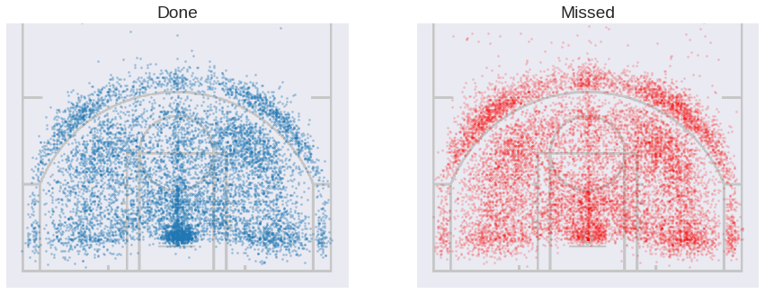
Let’s plot the successfull and missed shots side by side. Here I followed this guide for the overlap with the court layout.
f, (ax1, ax2) = plt.subplots(1, 2, figsize=(15, 15))
court = plt.imread(folder + "fullcourt.png")
court = np.transpose(court, (1, 0, 2))

made = data[data['shot_made_flag'] == 1]
ax1.imshow(court, zorder=0, extent=[-250, 250, 0, 940])
ax1.scatter(made['loc_x'], made['loc_y'] + 52.5, s=5, alpha=0.4)
ax1.set(xlim=[-275, 275], ylim=[-25, 400], aspect=1)
ax1.set_title('Done')
ax1.get_yaxis().set_visible(False)
ax1.get_xaxis().set_visible(False)

missed = data[data['shot_made_flag'] == 0]
ax2.imshow(court, zorder=0, extent=[-250, 250, 0, 940])
ax2.scatter(missed['loc_x'], missed['loc_y'] + 52.5, s=5, color='red', alpha=0.2)
ax2.set(xlim=[-275, 275], ylim=[-25, 400], aspect=1)
ax2.set_title('Missed')
ax2.get_yaxis().set_visible(False)
ax2.get_xaxis().set_visible(False)

f.gca().set_aspect('equal')
f.subplots_adjust(hspace=0)
plt.show()
They look nice but not too informative. I am interested in the areas where Kobe’s effectivity is above and below his average, so let’s try plotting that. We will need to group shots in small areas and take the mean in each one.
data['loc_x_step'] = pd.cut(data['loc_x'], np.linspace(-250, 250, 40))
data['loc_y_step'] = pd.cut(data['loc_y'], np.linspace(0, 470, 40))

steps_count = data.groupby(['loc_y_step', 'loc_x_step'])['shot_made_flag'].count().unstack()
grouped = data.groupby(['loc_y_step', 'loc_x_step'])['shot_made_flag'].mean().unstack()
grouped[steps_count < 10] = np.NaN
mean = data.shot_made_flag.mean()

plt.figure(figsize=(15, 8))
sns.heatmap(grouped, xticklabels=False, yticklabels=False, square=True, cmap='coolwarm_r',
            vmin=0.5*mean, vmax=1.5*mean, center=data.shot_made_flag.mean())
plt.gca().invert_yaxis()
plt.ylim(0, 25)
plt.ylabel('')
plt.xlabel('')
plt.show()
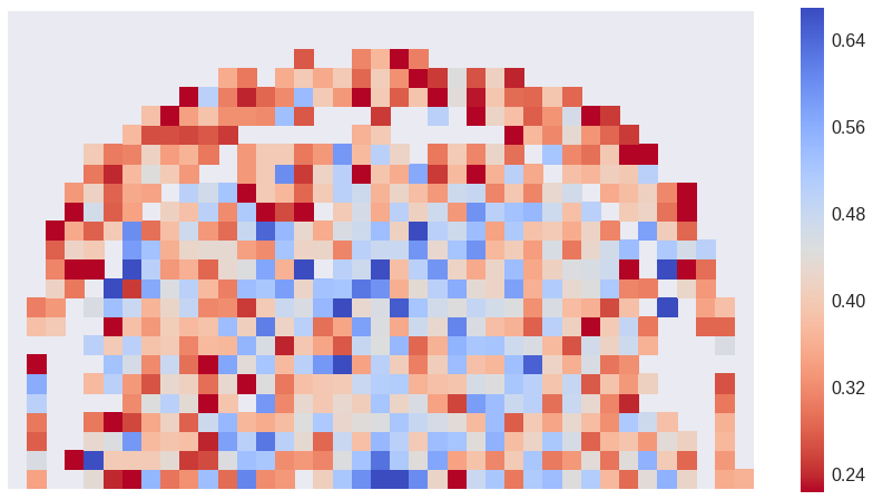
This is better. We see the decrease with distance to the hoop and the empty space close to the three point line: when close to it, Kobe prefers to attempt the three point shot.
We drop columns with redundant location information:
lat, lonshot_zone_areashot_zone_rangeshot_zone_basicshot_distance
They can all be represented more precisely with [loc_x, loc_y]. We will only keep the additional information of whether it was a 2PT or 3PT shot to account for hard to quantify psycological factors affecting the accuracy.
We also delete the columns ['game_id', 'game_event_id', 'shot_id'], they don’t provide relevant information for the model building.
drop_columns = ['game_id', 'game_event_id', 'team_id', 'team_name', 'lat', 'lon', 'shot_zone_area',
                'shot_zone_range', 'shot_zone_basic', 'shot_distance', 'shot_id']
data.drop(drop_columns, axis=1, inplace=True)

data['three_pointer'] = (data.shot_type.str[0] == '3').astype(int)
data.drop('shot_type', axis=1, inplace=True)
We don’t know the outcome of 5000 shots, so we’ll just delete those rows.
data = data[~data.shot_made_flag.isnull()]
Exploratory analysis and feature selection
Here we will plot some features to recognize which ones we should consider when builing a classification model for Kobe’s shots.
Shot type
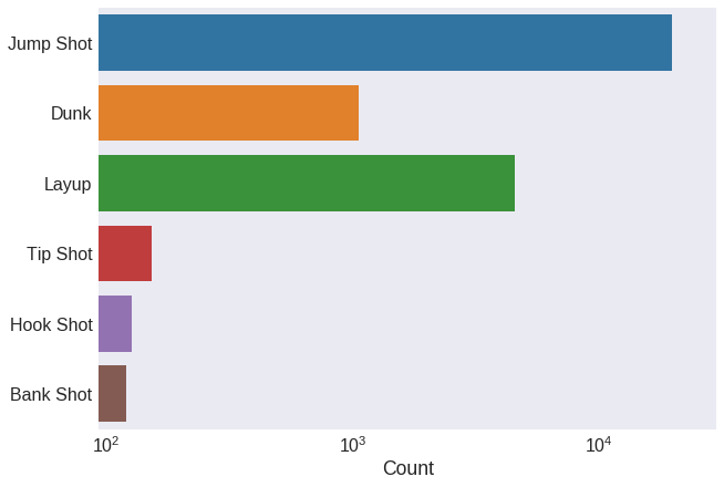
Let’s now look at the type of shot. First we count how many shots he took of each type. The dataset has two columns with this information: action_type and combined_shot_type.
plt.figure(figsize=(10, 7))
sns.countplot(y='combined_shot_type', data=data, log=True)
plt.xlim(xmax=30000)
plt.tick_params(axis='both', which='major')
plt.ylabel('')
plt.xlabel('Count')
plt.show()
plt.figure(figsize=(15, 15))
sns.countplot(y='action_type', data=data, order=data['action_type'].value_counts().index, log=True)
plt.xlim(xmax=20000)
plt.ylabel('')
plt.xlabel('Count')
plt.show()
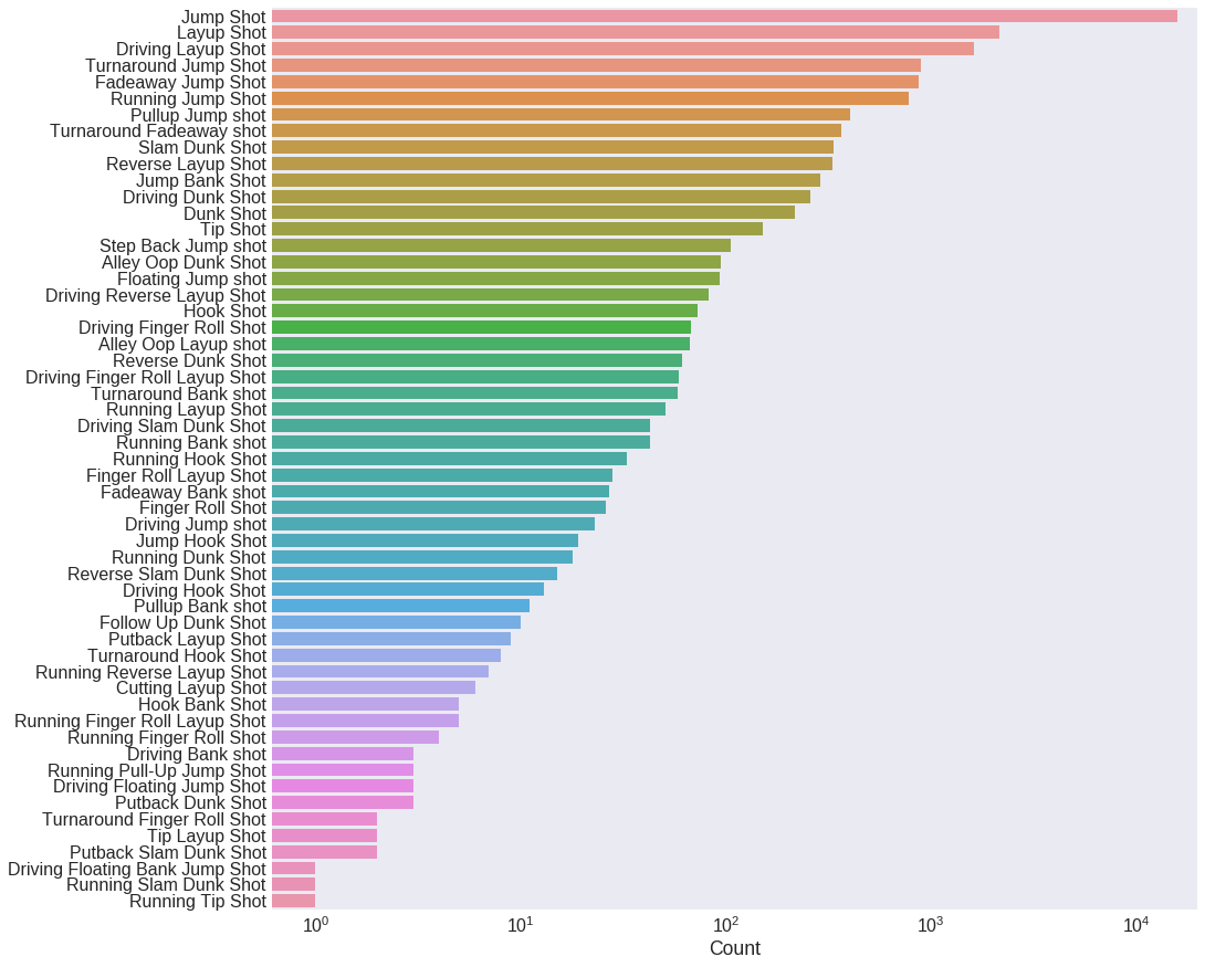
Seems like action_type has a lot more information than combined_shot_type, because of the greater number of shot types. To avoid information redundancy, we only work with action_type then.
Notice the logscale in the previous plot: most shot califications have only a few counts. Shots that were seldom used by Kobe will have no predictive value whatsover. We decide then to replace all action_type values with less than 100 occurrencies by the name Other.
data.loc[data.groupby('action_type').action_type.transform('count').lt(100), 'action_type'] = 'Other'
data.action_type = data.action_type.str.replace(' Shot', '', case=False)
data.drop('combined_shot_type', axis=1, inplace=True)
plt.figure(figsize=(15, 10))
sns.barplot(y='action_type', x='shot_made_flag', data=data)
plt.xlim(0.2, 1)
plt.ylabel('')
plt.show()
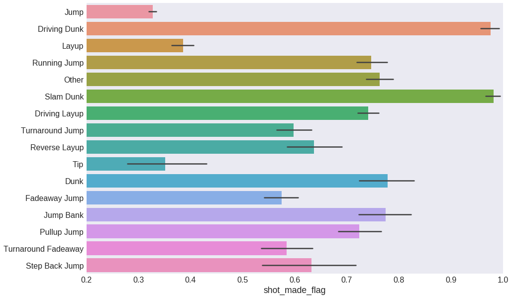
This already looks useful. Each kind of shot seems to have a distinct effectivity, and therefore action_type will be a good predictive feature for our model. We can now safely disregard combined_shot_type.
Timing
The timestamp of each shot spans several time scales:
- Season
- Date
- Whether the game was part of the NBA playoffs phase
- Game period
- Minutes and seconds remaining on the clock
We will take a look into each one to identify which features we need and which ones we can drop.
Season
plt.figure(figsize=(18, 10))
sns.pointplot(x='season', y='shot_made_flag', data=data, order=sorted(list(data['season'].unique())))
plt.gca().set_xticklabels([x[2:] for x in sorted(list(data['season'].unique()))])
plt.gca().set_ylim(0.25, 0.55)
plt.xlabel('Season')
plt.grid()
plt.show()
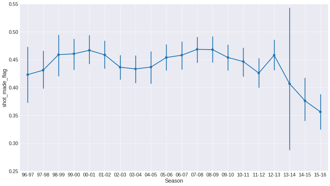
The effectivity shows a very clear dependecy respect to the season. This means that the season will be a relevant feature for modelling. The big error bar for season 13-14 is due to the low number of shots Kobe took that year: he was injured during most of the season.
Also, let’s replace the season by consecutive numbering starting on 0.
initialSeason = data.season.str[:4].astype(int).min()
data.season = data.season.str[:4].astype(int) - initialSeason
Date and playoffs
We can safely assume that the specific date does not affect the shot effectivity. Therefore, we only keep month information to catch more plausible seasonal effects.
data['month'] = data['game_date'].str[5:7]
data.drop('game_date', axis=1, inplace=True)
fig = plt.figure(figsize=(10, 7))
sns.pointplot(x='month', y='shot_made_flag', data=data,
              order=['10', '11', '12', '01', '02', '03', '04', '05', '06'])
plt.ylim(0.36, 0.5)
plt.show()
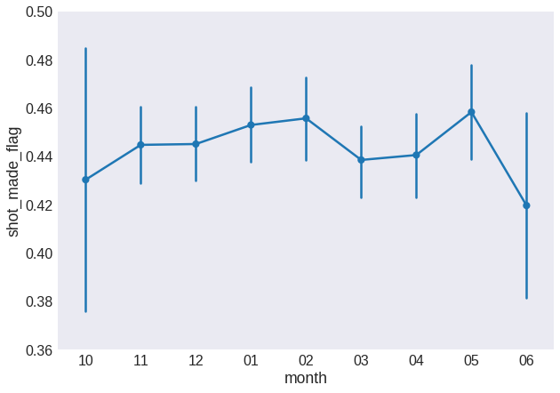
Also, we need to fix the month order: some models will have a hard time dealing with the discontinuity between months 12 and 01. We will replace it for sequential numbering from the first month of the season, labeled as 0.
data.month.replace(data.month.unique(), np.arange(len(data.month.unique())), inplace=True)
Let’s compare the effectivity of the regular and playoff phases.
fig = plt.figure(figsize=(10, 7))
sns.barplot(x='playoffs', y='shot_made_flag', data=data)
plt.ylim(0.42, 0.48)
plt.show()
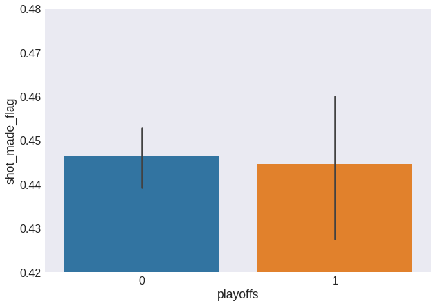
Whether the game is part of the playoffs phase does not seem to affect Kobe’s shot effectivity. We can therefore remove this input feature from the dataset.
data.drop('playoffs', axis=1, inplace=True)
Game period and minutes remaining
fig = plt.figure(figsize=(10, 7))
sns.pointplot(x='period', y='shot_made_flag', data=data, scale=0.75)
plt.ylim(0.1, 0.8)
plt.show()
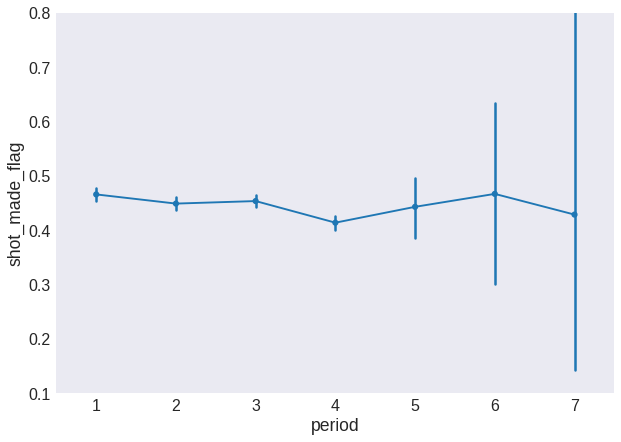
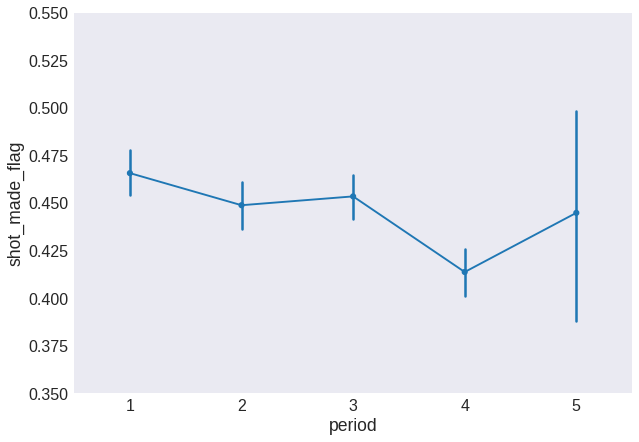
The big error bars are due to the low number of shots taken from overtime periods. Let’s merge the overtime periods into a single 5th period.
fig = plt.figure(figsize=(10, 7))
data.period.loc[data.period > 4] = 5
sns.pointplot(x='period', y='shot_made_flag', data=data, scale=0.75)
plt.ylim(0.35, 0.55)
plt.show()
minutes_remaining and seconds_remaining can be merged into a single feature that we will call time_remaining and we will measure in seconds
data['time_remaining'] = data.minutes_remaining*60 + data.seconds_remaining
data.drop(['minutes_remaining', 'seconds_remaining'], axis=1, inplace=True)
plt.figure(figsize=(18, 10))
sns.pointplot(x='time_remaining', y='shot_made_flag', data=data)
plt.xlim(0, 60)
plt.ylim(0, 0.8)
plt.xticks(np.arange(0, 65, 5), np.arange(0, 65, 5))
plt.show()
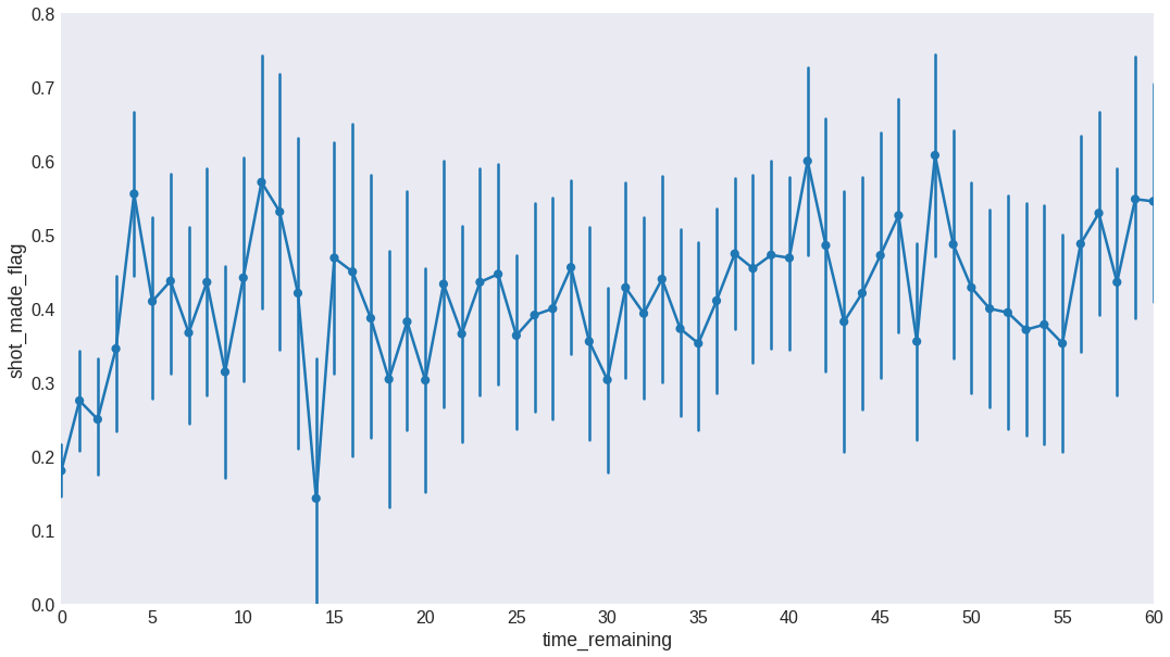
We see the effectivity is fairly constant except for the last couple of minutes shots. In order to keep this information while still reducing the number of features, we discretize time_remaining in 0, 1, 2, 3, 4, where 4 also includes all shots taken with more than 4 seconds remaining on the clock.
fig = plt.figure(figsize=(10, 7))
data.time_remaining.loc[data.time_remaining > 3] = 4
sns.pointplot(x='time_remaining', y='shot_made_flag', data=data)
plt.ylim(0.1, 0.5)
plt.show()
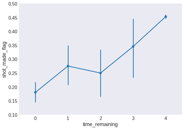
This trend looks useful for our model to pick up.
Location
Here we will explore
- Opponent
- Home vs away games
- Shot coordinates in the court
fig = plt.figure(figsize=(18, 10))
sns.barplot(x='opponent', y='shot_made_flag', data=data)
plt.ylim(0.2, 0.55)
plt.xticks(fontsize=12)
plt.show()
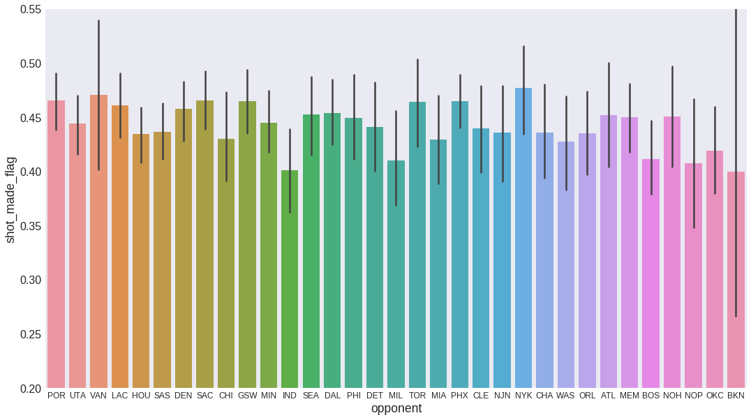
It does not seem to be any information here. Kobe’s effectivity values against all teams are well within the error bars. Therefore, we won’t include this feature in the model.
data.drop('opponent', axis=1, inplace=True)
We simplify game location and opponent information to just get whether Kobe was playing at home or not.
data['home'] = data['matchup'].str.contains('vs').astype(int)
data.drop('matchup', axis=1, inplace=True)

sns.barplot(x='home', y='shot_made_flag', data=data)
plt.ylim(0.4, 0.5)
plt.show()
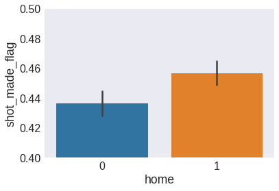
We see that Kobe is slightly more effective when at home, and therefore we will keep home as a feature.
sns.barplot(x='three_pointer', y='shot_made_flag', data=data)
plt.ylim(0.25, 0.5)
plt.show()
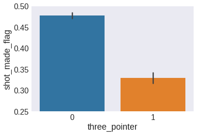
As expected, three-point shots have a lower effectivity than two-point shots.
The polar coordinate system offers a more natural representation for the shot location in cartesian coordinates. It will likely lead to a more robust model. Let’s transform the coordiantes then.
data['distance'] = np.round(np.sqrt(data.loc_x**2 + data.loc_y**2))
data['angle'] = np.arctan(data.loc_x/data.loc_y)
data['angle'].fillna(0, inplace=True)
data.drop(['loc_x', 'loc_y', 'loc_x_step', 'loc_y_step'], axis=1, inplace=True)
/home/federico/.local/lib/python3.6/site-packages/ipykernel_launcher.py:2: RuntimeWarning: invalid value encountered in arctan
fig = plt.figure(figsize=(15, 10))
sns.pointplot(x='distance', y='shot_made_flag', data=data)
plt.xticks(np.arange(0, 800, 50), np.arange(0, 800, 50))
plt.ylim(0, 1)
plt.xlim(0, 400)
plt.show()
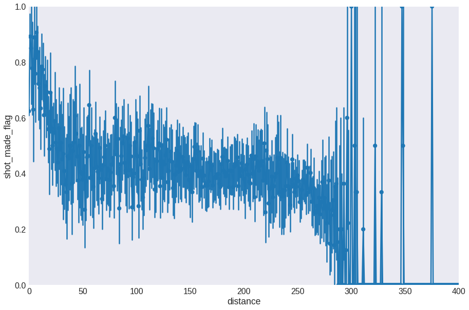
The signal here is very noisy, so let’s bin the distances and take the average effectivity for each bin.
fig = plt.figure(figsize=(15, 10))
data['distance_bin'] = pd.cut(data.distance, 15, labels=range(15))
sns.pointplot(x='distance_bin', y='shot_made_flag', data=data)
plt.xlabel('Distance bin')
plt.ylim(0, 0.7)
plt.show()
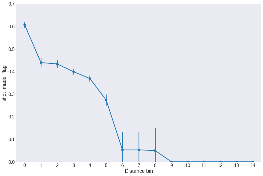
Now we see the effectivity peaks at distances closest to the basket and then there is a plateau that transitions into a slow decrease for shots taken from far away. It is important to note here that binning the distances have effectively redefined the distance unit.
Let’s keep distance_bin instead of distance.
data.drop('distance', axis=1, inplace=True)
Let’s now look at the angle of the shot. This is a very granulated feature, so I prefer to bin angles into intervals. We will go with 9 intervals.
asteps = 9
data['angle_bin'] = pd.cut(data.angle, asteps, labels=np.arange(asteps) - asteps//2)
fig = plt.figure(figsize=(15, 10))
sns.pointplot(x='angle_bin', y='shot_made_flag', data=data)
plt.ylim(0.36, 0.6)
plt.show()
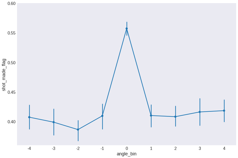
We see that the effectivity is slightly higher at angle = 0 and it seems to be minimum at around 45 degrees. We will keep angle_step and drop angle.
data.drop('angle', axis=1, inplace=True)
data.sample(10)
| action_type | period | season | shot_made_flag | three_pointer | month | time_remaining | home | distance_bin | angle_bin | |
|---|---|---|---|---|---|---|---|---|---|---|
| 6095 | Jump | 2 | 7 | 1.0 | 0 | 6 | 4 | 1 | 3 | 1 |
| 9526 | Driving Layup | 3 | 9 | 0.0 | 0 | 6 | 4 | 0 | 0 | 0 |
| 17131 | Other | 3 | 14 | 1.0 | 0 | 3 | 4 | 0 | 0 | 3 |
| 13166 | Other | 3 | 12 | 1.0 | 0 | 0 | 4 | 1 | 0 | 0 |
| 24554 | Tip | 4 | 2 | 1.0 | 0 | 5 | 4 | 1 | 0 | 0 |
| 9561 | Jump | 2 | 9 | 1.0 | 0 | 6 | 4 | 0 | 2 | 2 |
| 4357 | Jump | 3 | 6 | 1.0 | 1 | 4 | 4 | 0 | 4 | 2 |
| 19025 | Turnaround Jump | 3 | 15 | 0.0 | 1 | 5 | 4 | 0 | 4 | 2 |
| 22626 | Pullup Jump | 1 | 19 | 1.0 | 0 | 5 | 4 | 1 | 3 | 2 |
| 7462 | Jump | 3 | 8 | 0.0 | 0 | 6 | 4 | 1 | 2 | 0 |
This is the result of our exploratory analysis: the dataset containing the most relevant features in relation to the shot effectivity. We will use them to try to predict the outcome with a classification model in the next section.
Modelling Kobe
Baseline calculation
Before going any further, it is important to get a baseline result to compare the results of our model to (see here for a more detailed explanation of why this matters). In this case, we can use Kobe’s shots. Sadly, this is Kobe missing the shot:
round(100*(1 - data.shot_made_flag.mean()))
55
Therefore, if we predict a miss for every shot, we would be correct 55% of the time. The model we build here has to perform at least better than this. Let’s go then.
Feature encoding
Based on the analysis of each feature done in the previous section, we split columns into features X and target y (the shot outcome).
X = data[['action_type', 'period', 'season', 'three_pointer', 'month', 'time_remaining', 'home', 'distance_bin', 'angle_bin']]
y = data['shot_made_flag']
We need to encode cathegorical features (like action_type) into numerical ones, so that they can be picked up by a model. Following this guide:
dummies = pd.get_dummies(X.action_type, prefix='shot', drop_first=True)

X = pd.concat([X, dummies], axis=1)

# now we drop the original action_type column
X.drop(['action_type'], axis=1, inplace=True)
Modelling with a Random Forest Classifier
Our dataset is now ready to be fed into a model. I was interested in learning more about Random Forests so I chose that model.
First we split data into the train and test sets. Having separate train and test sets is important to check that the model doesn’t overfit the data. To know more about the purpose of each set, I recommend this short article.
from sklearn.ensemble import RandomForestClassifier
from sklearn import model_selection
from sklearn import metrics

X_train, X_test, y_train, y_test = model_selection.train_test_split(X, y, test_size=0.2)
I would like to find the best RandomForestClassifier model for this data. This means tuning the hyperparameters that define the model. We will need to create multiple models with different hyperparameters and find out which one works best with our data. However, we can’t use the test set for measuring the performance of each model, because doing so would introduce bias when we later want to evaluate the accuracy of our model. Therefore, we need to further split the train set to use a part of it (the cross-validation set) for hyperparameter tuning. Fortunately, the GridSearchCV function automates this whole process for us. The fit method will take different splits of (X_train, y_train) and maximize the cross-validation accuracy across all combinations of parameters in param_grid. Then we will keep the best parameters to build our final model.
For this section, I will follow the guide in this excellent blog post. Some mode advice on building these kind of models can be found here and in the answers to this question.
rfc = RandomForestClassifier(n_jobs=-1, max_features='sqrt', oob_score=True)

# Parameter sweep values
param_grid = {"n_estimators" : [60, 80, 100],
              "max_depth" : [10, 15, 30],
              "min_samples_leaf" : [5, 10, 20]}
CV_rfc = model_selection.GridSearchCV(estimator=rfc, param_grid=param_grid, cv=10)
CV_rfc.fit(X_train, y_train)

print(CV_rfc.best_params_)
{'max_depth': 15, 'min_samples_leaf': 5, 'n_estimators': 60}
We now build the model using the best parameters we found and we train it with the complete train sets X_train and y_train to evaluate the performance of the model in the test set. We want to make sure that the model generalizes well, that is, that it does not overfit the data.
seed = 123

# Optimized RF classifier
rfc = RandomForestClassifier(n_estimators=CV_rfc.best_params_['n_estimators'],
                             max_depth=CV_rfc.best_params_['max_depth'],
                             min_samples_leaf=CV_rfc.best_params_['min_samples_leaf'],
                             max_features='sqrt')

kfold = model_selection.KFold(n_splits=10, random_state=seed)

# fit the model with training set
scores = model_selection.cross_val_score(rfc, X_train, y_train, cv=kfold, scoring='accuracy')
print("Train accuracy {:.1f} (+/- {:.2f})".format(scores.mean()*100, scores.std()*100))

# predict on testing set
preds = model_selection.cross_val_predict(rfc, X_test, y_test, cv=kfold)
print("Test accuracy {:.2f}".format(100*metrics.accuracy_score(y_test, preds)))
Train accuracy 67.8 (+/- 1.05)
Test accuracy 68.79
We see that
- Modelling the data with a RandomForestClassifier model brings the predicting power from the baseline estimation of 55% to a more successful 68%. This corresponds to a 13% improvement. Not so bad!
- Since the train accuracy matches the test accuracy, we can safely say that the model is not overfitting the data and then it will generalize well to new data.
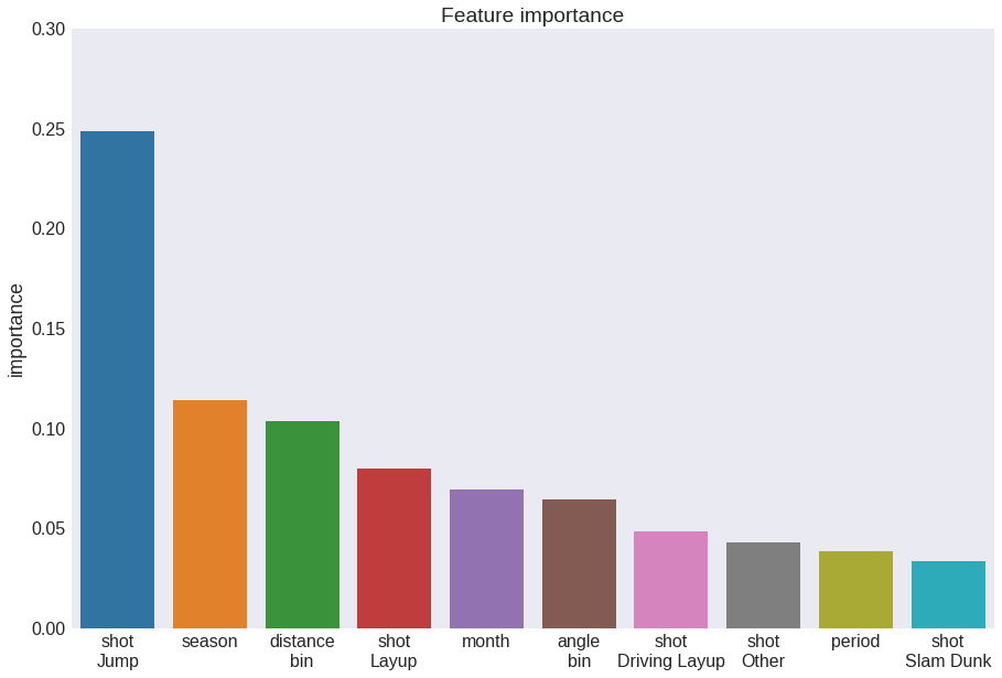
Now we can build the final model by training with the whole available dataset (see here for a good explanation as to why this makes sense). Then, we can evaluate the relative importance of features in predicting the outcome of each shot.
fig = plt.figure(figsize=(15, 10))
rfc.fit(X, y)
feature_importances = pd.DataFrame(rfc.feature_importances_, index=X_train.columns,
                                   columns=['importance']).sort_values('importance', ascending=False)
feature_importances.index = feature_importances.index.str.replace('_', '\n')
sns.barplot(feature_importances.index[:10], feature_importances.importance[:10])
plt.title('Feature importance')
plt.ylim(0, 0.3)
plt.show()
Lastly, just for fun I would like to visualize one of the 120 Decision Trees that make up our beloved Random Forest Classifier. Here I am following this easy guide.
# Pick one of the trees
estimator = rfc.estimators_[5]

# Export as dot file
from sklearn.tree import export_graphviz
export_graphviz(estimator, out_file='tree.dot', feature_names=X.columns, class_names='shot_made',
                rounded=True, proportion=False, precision=2, filled=True)

# Convert to png using system command (requires Graphviz)
from subprocess import call
call(['dot', '-Tpng', 'tree.dot', '-o', 'tree.png', '-Gdpi=600'])

# Display in jupyter notebook
from IPython.display import Image
plt.figure(figsize=(15, 10))
Image(filename='tree.png')

If you zoom in enough, you will be able to see exactly all the decisions that split the data into predicted misses and predicted hoops. This doesn’t give the full picture nor it’s really informative but it gives a nice idea of how the model works.
Final remarks
More things that could be done with this dataset
- Compare these results with what we get with different models.
- Analyze how many features we can remove and still get decent accuracy.
I will leave it like this for now. If you made it this far, thank you! I hope you find some of it useful. If you think I could have done it differently, please leave a comment or contact me through any of the channels, I will be happy to exchange some thoughts.
You can find the jupyter notebook of this post here.